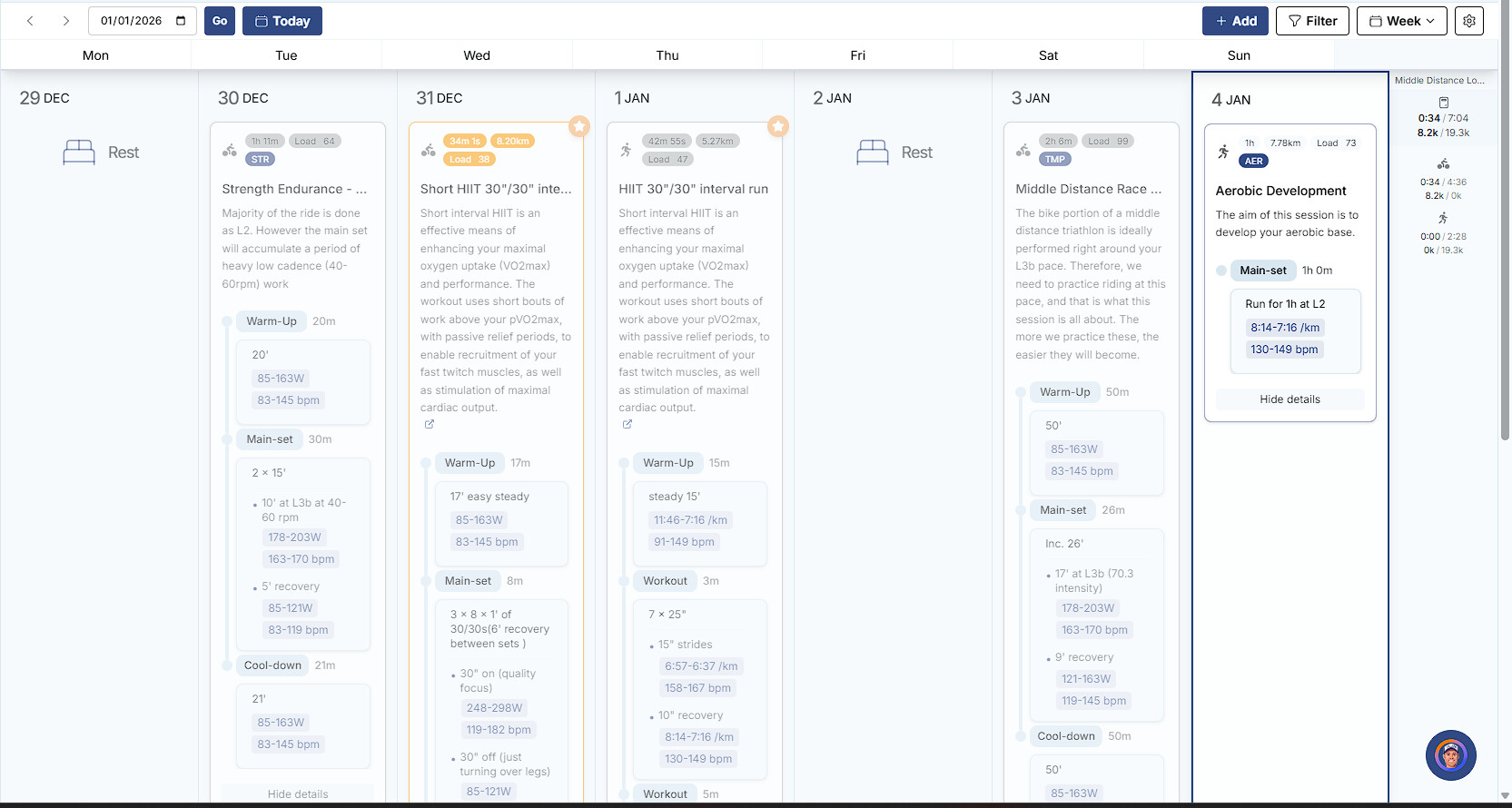
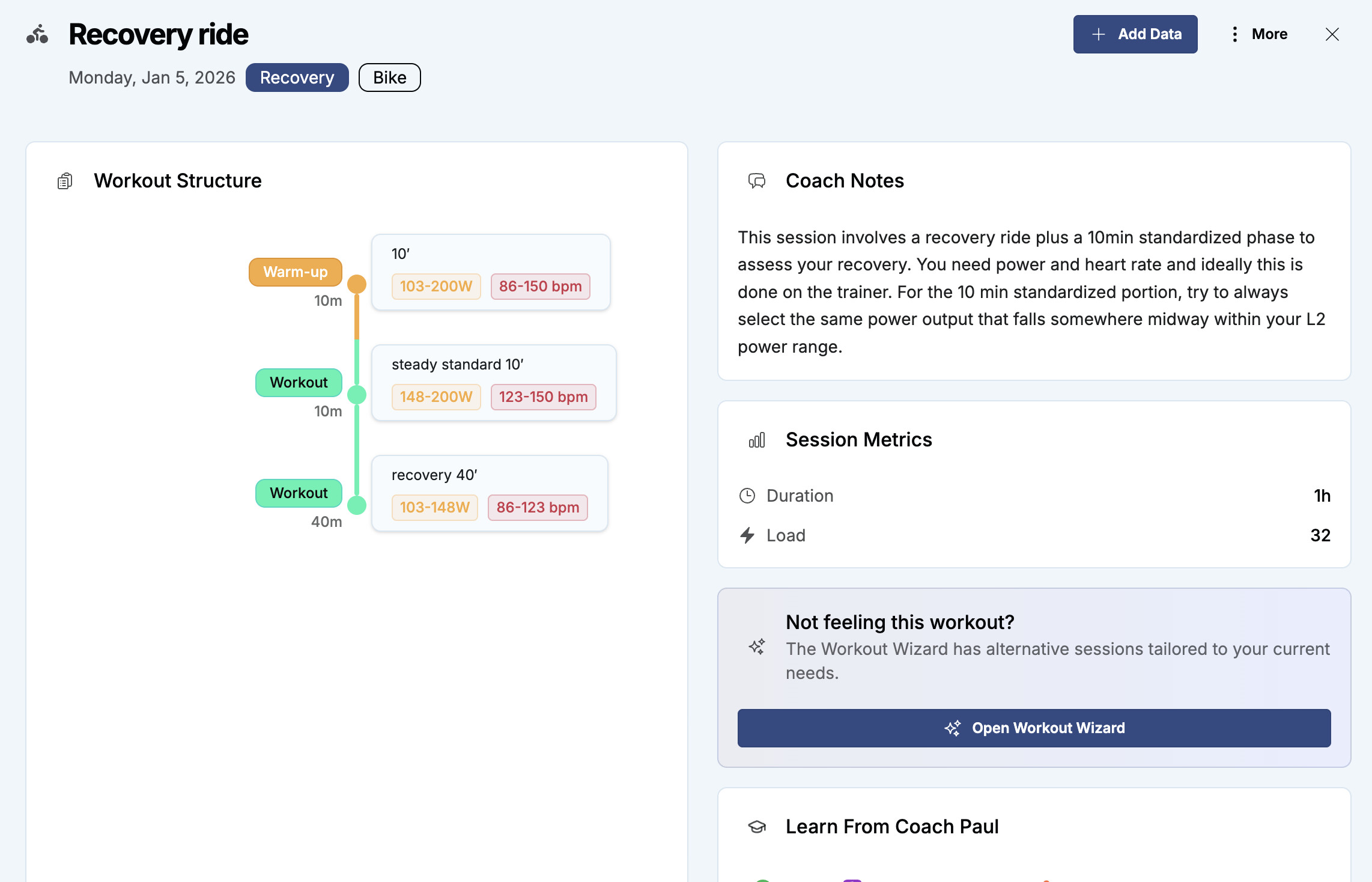
I mean, in my opinion, it’s much less readable, the details take up much more space (you have to scroll to get to the bottom), you have to click on the session to get the video links… Maybe I’m missing something?
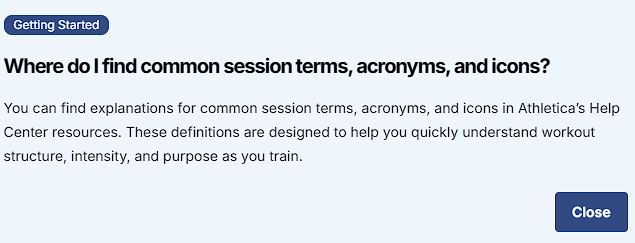
also, There used to be a glossary with training terms, acronyms, accessible via the calendar at the top right of the screen, but I can’t find it anymore
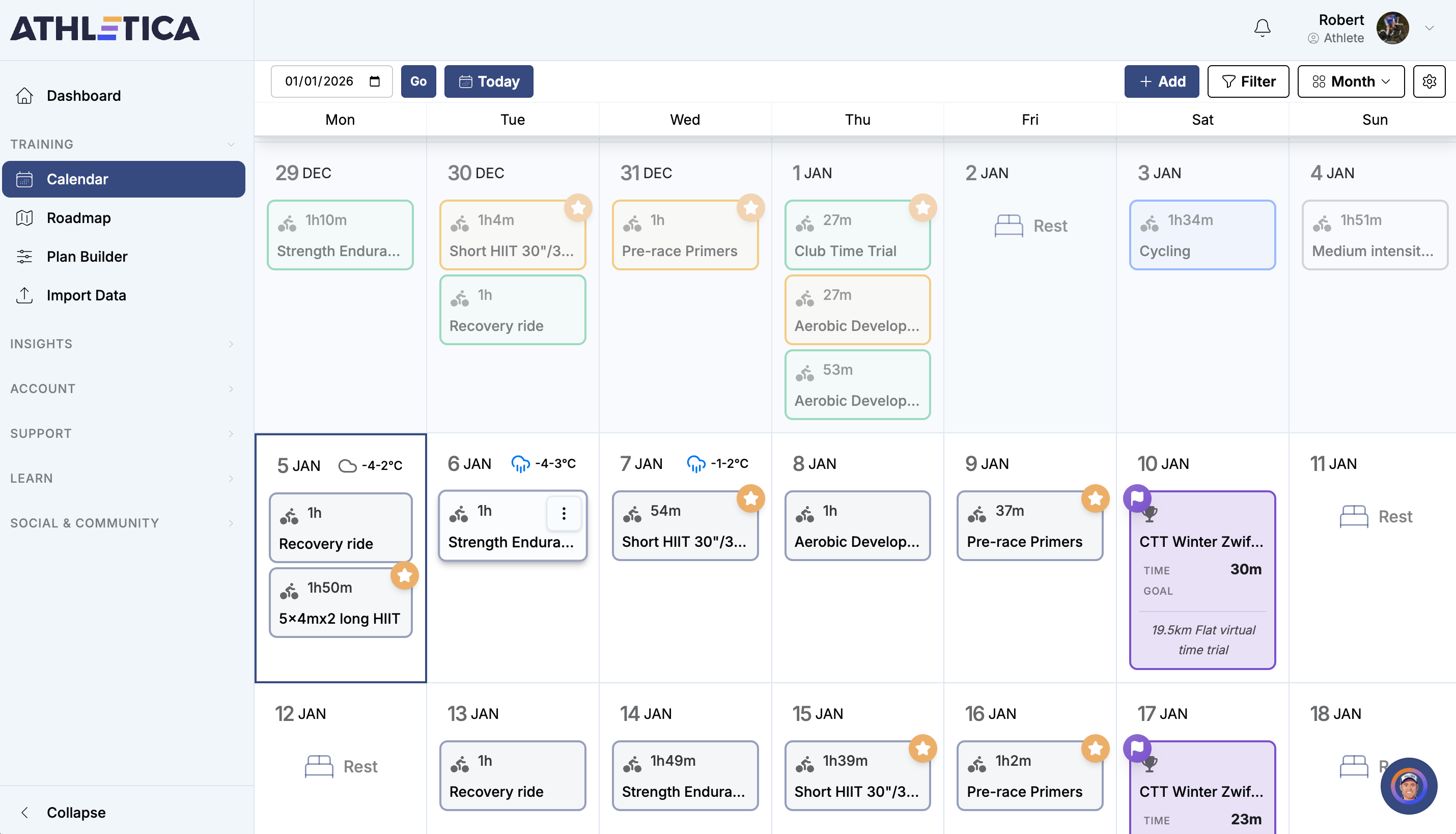
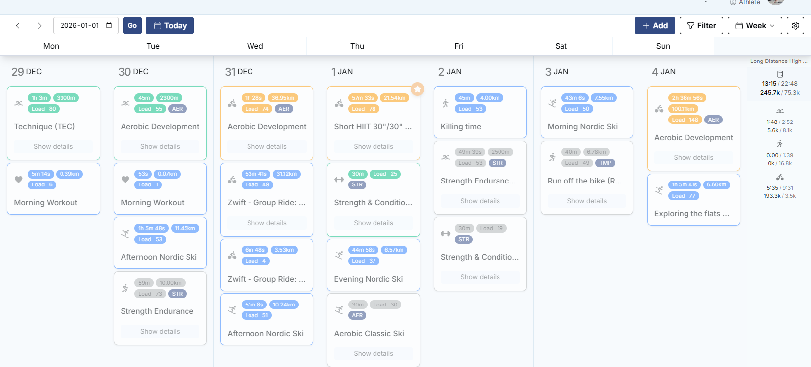
I’m finding the whole calendar display a great improvement, and it has made a big difference to scanning through weeks.
Hopefully the issues with uploading workouts will get sorted soon (I seeing delays of about 24h for workout upload). Until that’s sorted, it is a little awkward to play around with the AI Coach conversations.
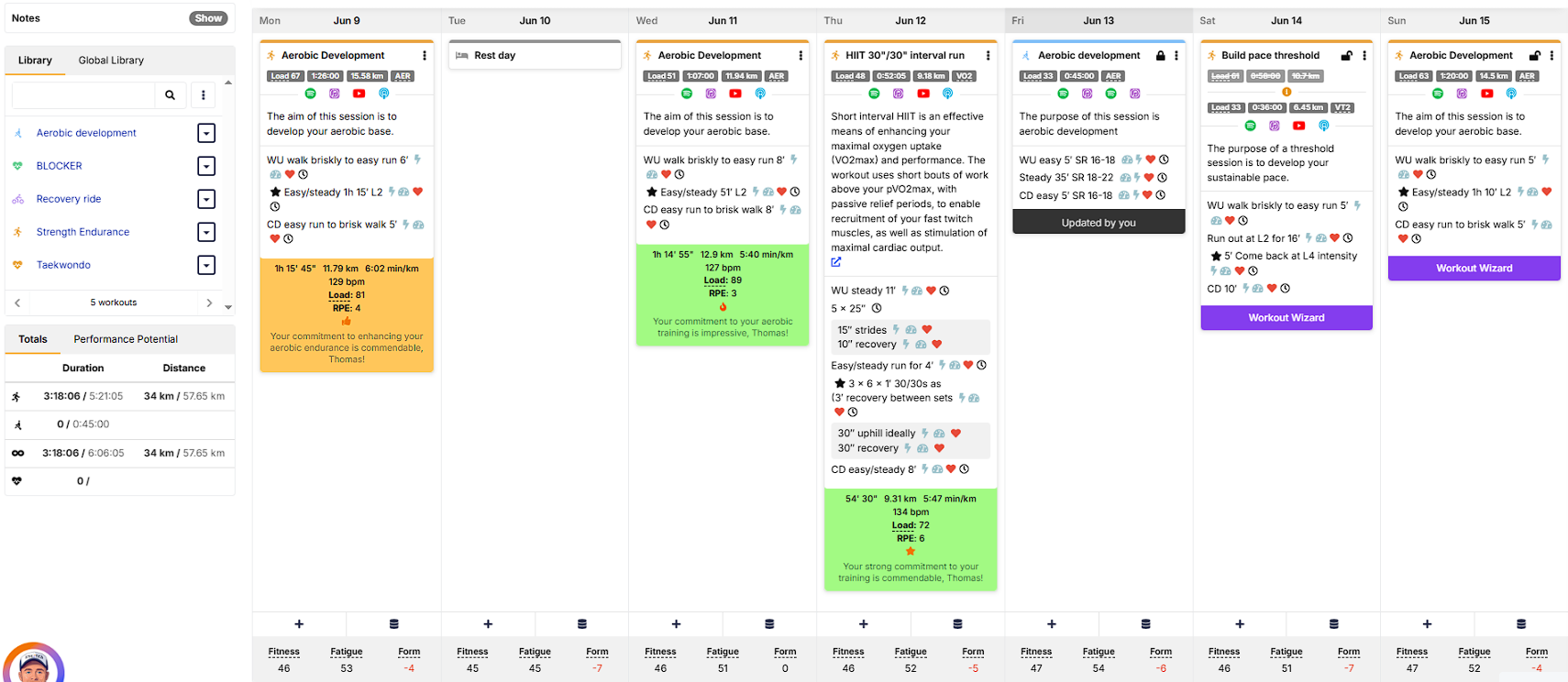
I love the new calendar as well - there are different ways you can display information on your screen - monthly view, weekly view - with totals, without totals, with desciption, without description - so you can display the info how you would like to see it. Also you can default to land on the dashboard view first if you prefer that (vs. default to calendar view). This is my favourite view (condensed weekly view with totals):