Intervals.icu imports data from HRV4Training, without an API - I have HRV4Training set to save to a folder in Dropbox, and Intervals uploads it from there. After filling out the daily questionnaire in HRV4Training, it’s only a couple more taps to do this. The import is just parsing a csv file.
As I recall, the iOS version of HRV4Training saves the file slightly differently than the Android version that I use.
I’ve had this and it’s not so much that sessions were unplanned. I might often record a main session separate from the warn up or cool down. Which means there maybe one planned session with two or three actual sessions. The total load is about right and the intervals I did as best.
It would be better in my view if the AI avatar took a more holistic view at the overall load executed each day and over the week. To give a view of actual load vs. planned and progressive overload.
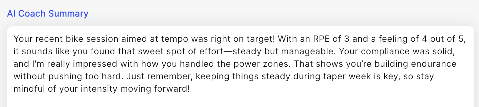
So I don’t know if it’s the coach avatar / beta glitch, or just the existing fully released AI feedback, but said coach is acting like a drunken sailor.
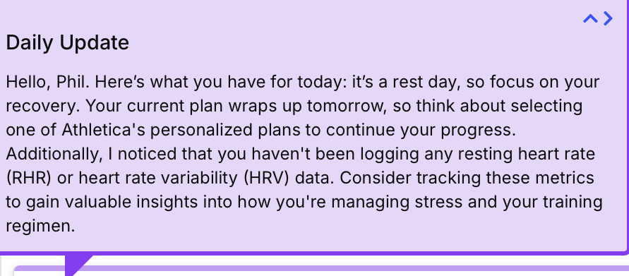
Your current plan concludes tomorrow, so think about selecting one of Athletica’s personalized plans to continue your progress.
No it doesn’t. In fact it’s only just entering week 2.
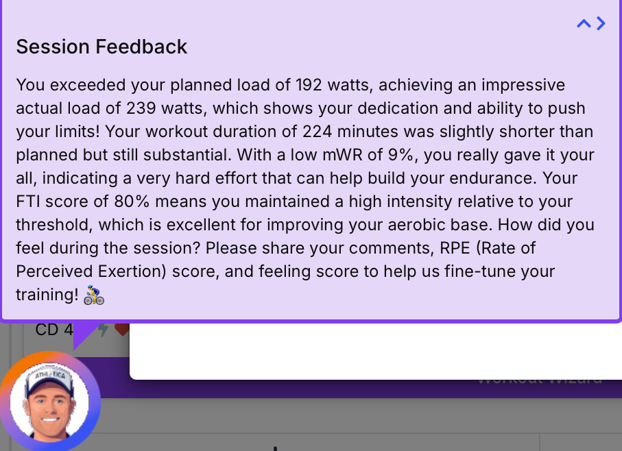
You executed your planned aerobic run with admirable compliance, completing 66 minutes instead of the planned 50, which shows your dedication!
Like others have experienced, 66 is actually the load, not the duration.
I’m not an expert on AI, but based on some general stuf I’ve read and my own experience using large language models to try to summarize financial stuff, they are generally not great with numbers. They get confused very easily. I wonder if the AI description is just an application of one of those models to the table spit out by athletica based on the incoming Garmin file.
If the coach is utilising one of the LLMs (which I assume it may be), just wait until he advises violent solutions or refuses to say certain completely random and innocent words
Hi! Little feedback from me I really like the AI summary feature, but I think the usability could be improved with a different approach. Here are my thoughts:
Daily Summary Placement
I’d prefer to have the daily summary moved to the overview page (my homepage). That’s where I expect to find information like how I’m feeling today, what’s ahead, today’s training, and the daily summary. It feels like the most logical place for this kind of information.
Workout Summary Placement
I think the workout summary should be shown directly under the workout details. Right now, having to open the AI coach and then go into workout details isn’t intuitive. Honestly, I wouldn’t have known to look there if I hadn’t read about it in this forum.
UX Improvements
From a user experience perspective, I’d prefer to see summaries in the specific areas where I’m already looking for related information.
Design Suggestions
I feel the current design of the summary bubble in the corner of the page could be improved. It looks a bit out of place and reminds me of a chatbot, which might confuse users into thinking it’s meant for chatting. A more integrated design would look cleaner, consistent, and more elegant.
Don’t get me wrong—I love the summaries and that the information is available! I just think these changes could make the experience even better.
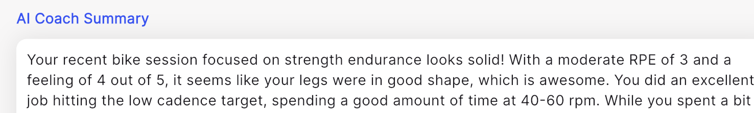
Hah, except mine said my cadence of <60 was too low and try to do better next time … when the workout called for <60 . Love that it’s getting little nuggets and more granular though, huge progress!
The high load was one of my events, and since they are ultra distance they will have a high load.. The AI coach needs to distinguish going off the training plan, and what happens during an event.