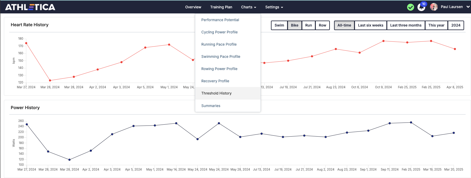
We’re excited to share a brand-new feature now available exclusively to our beta testers: Threshold History.
This chart gives you a visual timeline of your Critical Power, Critical Speed, and Critical Heart Rate across the key Athletica training modalities: Running Cycling Swimming Rowing
You can now track how your thresholds have evolved over time, helping you better understand your fitness trends, training impact, and performance trajectory.
Please take a moment to explore this feature and let us know if you encounter any issues
Great feature. However, only my bike power is up to last week, my Bike HR is up to Oct 14, my Run HR is up to Feb, while my Pace is up to March, and for my swim it is only until Sep 14, 24
Thanks @Jerome. I’m told that the database is not since inception but only since our backend started tracking these. So there will be incomplete data sets to begin here I’m afraid.
Hi everyone!
Thanks for those new features
Here is my feedback. Can you explain how the calculation is done? Because, if I believe the data of these tables, I have not progressed since I follow the training program. It’s even the opposite, I would even have seriously regressed
I have the feeling that the program calculate those thresholds based on non -specific sessions. It is clear that my FTP, for example, will seem lower during an L2 training than during another incorporating Sweet Spot passages.
Thanks anyway for those continuous development
Similar to @Fabrice I think the values don’t reflect what my true critical power may be. You’re not going to see my true 5’ , 10’, 20’ best efforts if I am aiming to complete the typical number of intervals proscribed. Plus the AI coach will be critical if I go above the power ranges given for a duration, discouraging trying a max effort.
It would be good if the chart showed me (when I tap on a particular data point) which specific sessions and what durations the critical power was calculated off.
It would also be good if I was scheduled every now and again a single interval of the durations used for the calculation with the instruction to try and make it a max effort. Maybe an hour of Z2 with the interval somewhere in the middle.
Thank you for implementing a requested feature! It will be nice to be able to track this over time.
Because there are so many reasons that zones change over time - because they are changed manually, because of testing weeks, and because of changes detected by Athletica in the course of following a training plan outside of testing…I think it is important to add the context for the change - this would mean including 1) who/what made the change (athlete, coach, Athletica), and 2) the associated workout / data / reason that prompted the change.
This information would also be helpful in the notifications that pop-up, and in deciding whether or not to accept the change.
For example, I often reject proposed changes to zones because I don’t understand why they are being made (outside of testing weeks), and I’m concerned that they will bounce around a lot / are being made for the “wrong” reason and the changes won’t mean much to me in retrospect.