Hi Athletica fans. We’re constantly working to update and improve the design of the Athletica app. We’re hoping to use this thread to get your feedback and suggestions around specific elements we’re working on and to give you some early previews of what’s to come when it’s ready.
Honestly, and I’m going to be in the minority here, I like the current one. I’m wary of bloated UI that look good but take forever to load or have other issues. Right now it feels utilitarian and that works for me.
Thank you @ashleyidesign for your feedback and you aren’t in the minority here at all. Our goal is to simplify and clean up the UI but make it so the key elements are there for different levels of athletes to use if they want. Keep an eye out on this thread as we float additional design elements for input. Thanks again!
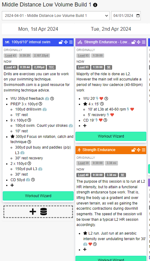
I think this is in beta, but it is too easy to accidentally edit a planned session when scrolling on a tablet. Then the session says added by you and workout wizard disappears with no way to undo.
I would prefer that either
- Editing is turned off by default, with an option to turn on by session.
- There’s a confirmation dialogue for changes and an undo button.
The drag and drop feature for sessions
I would prefer that the drop area is just below the day and date. Then it is easier to see which day you are dragging to rather than finding you have dragged to the wrong day.
I don’t know if this is specifically design, but I’d be great if you could specify a day off. I take Sunday’s off and there is no way to tell Athletica that besides manually moving workouts.
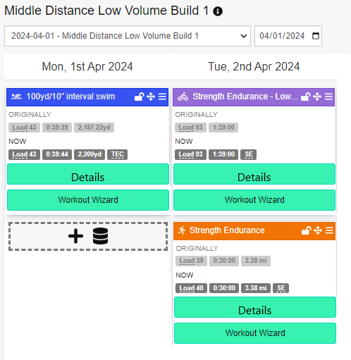
The calendar (or training plan) interface feels busy. It would be easier to get an overall idea of the week if it was condensed.
This would also make it harder to accidently hit the “add new detail”, as @Phil noted, since it would be hidden behind the “Details” button.
Excellent feedback @bfrostieone… I can confirm that the latest design specs are massively reduced and simplified with more detail available once you click through. So think you’ll be pleased on first iteration.
I absolutely agree here. Rather than everyone able to edit the session, I would give useful tips on how to alter execution on the fly - depending how one feels of course. Not feeling juicy after first set of intervals, cool down and go home. Feeling extra energetic and on top of the world, add another half a set or full set… don’t have time for the whole workout, cut down on warm up/cool down.
Like others have said, the interface is just a bit busy looking at the moment. However I do think all of the info on the main screen is useful.
Changes I would love to see:
-
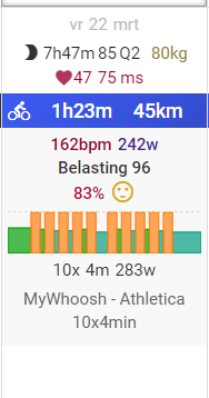
Instead of the full workout explanation, have a small preview of the workout in the form of the workout graph. Like TR and Intervals.icu do. When clicking or hovering the workout, have the detailled explanation.
-
The ability to just scroll through the plan would be nice, instead of having to click “next week”. Combined with this, have the weekly summary (prescribed and actual hours/load) on the same line as the days of the week. Like on Trainingpeaks and Intervals.icu
-
I don’t use the power profile on Athletica because I don’t find it to be user friendly. But this isn’t the main focus of the program so that’s fine.
-
Not really UI, but the ability to put in stage races and/or races that are not in the weekends.
Exited to see how it turns out!
We’re right on page with you on those items @Aradell … coming soon…
I would just like a different button to edit instead of how it is right now where you click on the details of the work, but personally I still want to be able to edit workouts. For my trainer bike I need to be in a workout to modify the elevation of the trainer so I can hit the right watts without being in ERG. When my workout ends I got from spinning in mid 170s to 130 for example just because of the gearing and my indoor setting. So I rely on the ability to edit a bit of I know I may have to cut down Saturday’s session so I will increase Friday’s or whatever. (Oh I see now the ability to edit is already there, I guess yeah just remove the accidental clicking on details lol).
The app previously defaulted to the plan overview page. I liked that because it gave a snapshot of the day vs the whole week and showed the performance profile. I think this view works better when viewing on your phone vs the whole week to scroll through. I agree with others to show a condensed version of each workout. And also there should be a lock button for editing sessions as I’ve done it by mistake several times when using iPad. I also miss the different colours changing for ‘as planned’, ‘above’, and ‘below’. Now we have maps on there, how about the opportunity to add a photo?
When viewing on my phone, it loads then moves down to the current day. As the week goes on, I am further down the page. If I want to view next week I have to scroll all the way back up to the top to push the next button. I would like to see the next and back buttons at the bottom of the week as well if possible. However, if moving forward to a more condensed version it may not be such a first world problem anymore and I can easily scroll back to the top. With all the details expanded just seems like a pain to keep scrolling up.
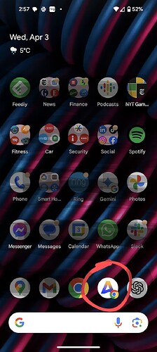
what is the name of the app?
Thanks @Phil this is on the list of fixes. I also use a tablet a lot and find this frustrating.
@Kathy03csi this is great feedback and a case of one of those things that us regular users have just learned to live with. There is a better way for sure and we’ll add it to the design plan. Thank you!
Hi @Cathleen - we don’t yet have an Athletica app in the app store, so it is the Athletica web app that you can also use on your phone and tablet. You can either go to https://app.athletica.ai on your browser or you can add it to your phone/tablet’s home screen.
We’re hoping to have a better mobile experience available in the app stores in the next few months.
thanks i have that setup.
@Phil the scrolling issue on tablet should now be fixed. Please try it out and let me know if you are still experiencing the issue.


