Hi all,
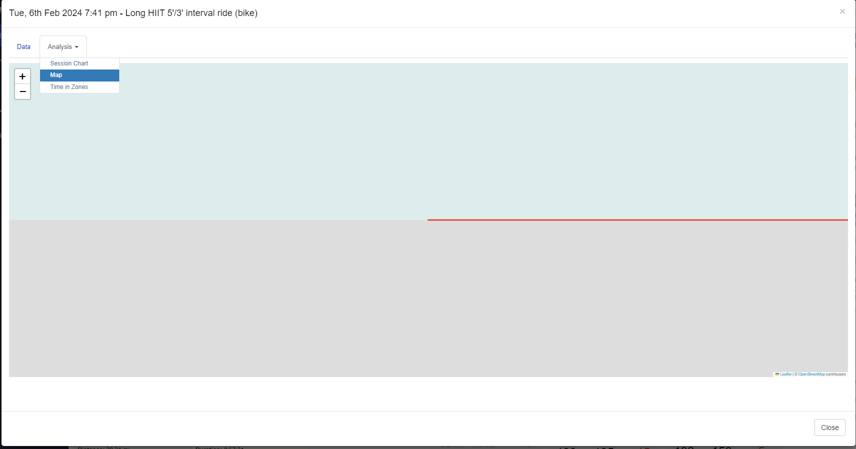
We’ve just added a map feature to the session analysis tabs after a workout has been completed and GPS enabled. Appreciate if our beta team could have a look and flag if any issues.
Thanks,
Paul
1 Like
Just checked very quickly, it works. Maybe a small improvement would be hiding the map menu option for the virtual rides as I believe it’s not gonna work there. Currently it says “Unable to display chart.”.
1 Like
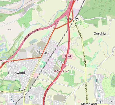
Thanks, Paul. Agreed you probably need to tweak how virtual rides are handled for this feature. See below the “map” of yesterday’s Zwift ride.
1 Like
This is great feedback beta team that I have passed on to dev ![]()
1 Like
@Prof This is hot beans!
I was curious when this was going to be added as it was part of the API access agreement.
Great from a coaching perspective to see geographical information; maybe the Athlete has been running the same circle for years and a change could lead to a break through or level up.
2 Likes
No issues with my map today. I was thinking it could be used for visual analysis though. Where on the map did I hit my mWR? If it was an aerobic session where on the map did my power fall outside the proscribed range etc?
1 Like
Thank you for the heads up - maps look good! Seem to have populated for previous workouts as well (at least last week).
Would be great to see elevation changes and lap, pace/ HR overlays (and mWR as previously suggested).
2 Likes
I like it! Agree with above comments re: Zwift. Maybe some changes are happening in the background, but I don’t see the maps anymore (but saw them this am).
1 Like
Minor changes made include not showing tab (whenever possible) if no map data is available, such as not showing map for indoor rides
1 Like
Maps are a great idea if there is training data overlaid over the top (pace heatmap, tying it into mWR etc.), else for an athlete, it’s just a pretty picture cause we know where we ran/rode ![]() Being able to follow that along with a timeline also would be valuable for coaches to recreate the run/ride progression and see what happened.
Being able to follow that along with a timeline also would be valuable for coaches to recreate the run/ride progression and see what happened.
Strava probably are the best at this at the moment, and they do show maps for Zwift as well, so it must be possible.
But of course, understand, one step, then the next, so good job getting this up and running.
1 Like
Good day all,
I have come back to the map function a few times over the last several weeks and considering ways to leverage the function for Athletes beyond illustrating the path of their session.
Not sure what information following the GPS information in the API’s
Currently the performance potential chart is the primary visualization for athletic development. I feel like there is a large opportunity to showcase other factors of development rather than simply the numerical Bannister model; which I personally have to constantly remind myself that there are many other aspects of an athletes fitness journey beyond just driving up the “fitness” side of the model; all things we know but often miss keeping a balanced focus on (sleep, emotional socialization time, mental reflection/visualization, Ice Cream ![]() etc).
etc).
Depending on the associative capacity of the data (GPS Location, Pace, Power, HR, respiratory rate, etc) in the API feed I am curious if it is possible to analyze sections or whole session with similar data to be able to illustrate comparative change (+/-)?
Strava does “Matched Runs” which is one dimension (Pace) of what I am conceptualizing:
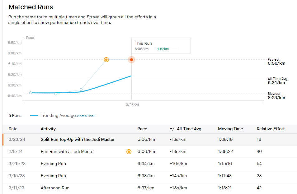
I feel like there are many ways to slice something like this up for a Coach or Self-Coached Athlete to isolate improvements and opportunities.
I feel like Garmin has marked me as “maintaining” my fitness, but I have found many smaller aspects of improvement or things to focus on rather then just training time and load (I know it isn’t that simple).
@Prof I am sure you know who I am referring to… Please clarify my reference here…there was the cycling team who brought in coach/trainer who was famously quoted as saying the difference is in the 1% changes and made several small seemingly insignificant changes and changed the team into a juggernaut to be reckoned with.
If Atheltica could shine a light on some of the “1%'rs” not unlike WR it would be a game changer for both coaches and athletes.
In my attached image pace is the easy thing to pickup, but I am a premium subscriber for the “Relative Effort” metric for each session along with the weekly Relative Effort cumulative.
In the example I can see I am not seeing pace increases, but more importantly (for me) my relative effort within the increased pace is decreasing.
My session RPE almost always aligns with the “Relative Effort” metric which acts like reasonable check point for my RPE session qualification.
Quick thought as I am typing…a report that correlates somehow: Session HR, RPE, Pace and trending HRV to help identify illness or overtraining, stress etc.
Any additional thoughts would be appreciated and welcomed.
1 Like
Really enjoyed the read and thoughts thanks @Cubicfunction. Tim Kerrison and marginal gains is what you were after. Food for thought here @Andrea ![]()
2 Likes
Yes! Thanks so much for clarifying my reference; I knew you would know who I was referencing. ![]()
Greatly appreciated.
1 Like